
Data Scientist
Introduction to PyCaret - Build ML models faster w/ less code
LearnDataSci is reader-supported. When you purchase through links on our site, earned commissions help support our team of writers, researchers, and designers at no extra cost to you.
Creating Regression Models with the PyCaret Library
Most machine learning practitioners start experimenting with the established scikit-learn library, but there's an easier and more approachable alternative, named PyCaret.
This library has many advantages compared to scikit-learn, especially for people with limited experience. This tutorial will provide an overview of the main features of PyCaret, as well as a case study focusing on regression. I suggest installing the latest version of Anaconda on Windows/macOS/Linux to follow this tutorial, but it is also compatible with Google Colab. You can either execute the code in a Jupyter notebook or use your preferred IDE.
Installing PyCaret
First of all, we have to install PyCaret by running the following command in an Anaconda terminal:
pip install pycaretPyCaret should then be installed on your machine and any other required dependencies that might be missing.
The PyCaret Regression Module
Regression is a basic supervised machine learning task which estimates the relationship between a dependent variable $y$ (known as the target) and independent variables (known as features).
Regression can be used to predict continuous values such as the value of a house instead of classification, which is used for discrete values known as classes. The PyCaret regression module, which uses sklearn under the hood, lets you create and test regression models with a few lines of code. It includes a variety of algorithms, as well as the ability to plot and do hyperparameter tuning.
We are now going to examine a regression case study based on that module.
Loading a Dataset
The basis of every machine learning project is the acquisition or creation of an appropriate dataset. PyCaret includes a variety of example datasets for different kinds of machine learning tasks, and in this project we will use the medical insurance dataset.
This dataset originates from the book Machine Learning with R by Brett Lantz, and contains health insurance information. The target variable, $y$, represents the insurance charges for each person, and the features are properties, such as age, sex, and Body Mass Index (BMI).
Real-world data is rarely that simple, but working with toy datasets helps us understand the concepts and methodology before moving on to more complex cases.
Here is a description for each dataset variable:
- age: age of the primary beneficiary
- sex: insurance contractor gender - female, male
- bmi: Body mass index, providing an understanding of body weights that are relatively high or low relative to height. An objective index of body weight ($kg / m ^ 2$) using the ratio of height to weight, ideally 18.5 to 24.9
- children: Number of children covered by health insurance / Number of dependents
- smoker: Smoking
- region: the beneficiary's residential area in the US, northeast, southeast, southwest, northwest.
- charges: Individual medical costs billed by health insurance
To get the data, we'll use the get_data function from pycaret:
from pycaret.datasets import get_data
data = get_data('insurance')| age | sex | bmi | children | smoker | region | charges | |
|---|---|---|---|---|---|---|---|
| 0 | 19 | female | 27.900 | 0 | yes | southwest | 16884.92400 |
| 1 | 18 | male | 33.770 | 1 | no | southeast | 1725.55230 |
| 2 | 28 | male | 33.000 | 3 | no | southeast | 4449.46200 |
| 3 | 33 | male | 22.705 | 0 | no | northwest | 21984.47061 |
| 4 | 32 | male | 28.880 | 0 | no | northwest | 3866.85520 |
data.info()<class 'pandas.core.frame.DataFrame'>
RangeIndex: 1338 entries, 0 to 1337
Data columns (total 7 columns):
# Column Non-Null Count Dtype
--- ------ -------------- -----
0 age 1338 non-null int64
1 sex 1338 non-null object
2 bmi 1338 non-null float64
3 children 1338 non-null int64
4 smoker 1338 non-null object
5 region 1338 non-null object
6 charges 1338 non-null float64
dtypes: float64(2), int64(2), object(3)
memory usage: 73.3+ KBThe get_data function returns a pandas dataframe, so we can use the info() function from pandas to get some details about the dataset.
As we can see, there are 1338 records, and zero null values. Most real-world datasets have some null values and may require some feature engineering, but in this case we don't have to deal with that.
Exploratory Data Analysis (EDA)
After loading the dataset, we will normally need to examine and understand its basic properties. This is known as Exploratory Data Analysis, and can be accomplished with various tools and methods, such as plotting.
We start by plotting the histograms of the numerical variables.
import matplotlib.pyplot as plt
import matplotlib as mpl
import seaborn as snssns.set_style('darkgrid')
colors = ['#851836', '#EDBD17', '#0E1428', '#407076', '#4C5B61']
sns.set_palette(sns.color_palette(colors))numerical = ['bmi', 'age', 'charges']
data[numerical].hist(bins=20, layout=(1, 3), figsize=(9,3))
plt.tight_layout()
plt.show()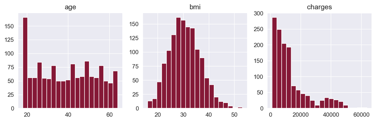
Here, we're using the built-in hist() function from pandas to plot a histogram for age, BMI, and charges. This helps us better understand the distribution of values for these numerical variables.
The BMI variable has a distribution close to normal, while the charges variable is right-skewed. Skewed distributions can be a problem for machine learning algorithms, so we will deal with that later.
Now, we'll get a bit creative by plotting the histogram of the target variable — i.e., the insurance charges — with stacked bars that represent different categories of the categorical variables. We accomplish this by using the histplot() function of the seaborn library:
categorical = ['sex', 'children', 'smoker', 'region']
fig, axs = plt.subplots(2, 2, figsize=(20,10))
for variable, ax in zip(categorical, axs.flatten()):
sns.histplot(data, x='charges', hue=variable, multiple='stack', ax=ax)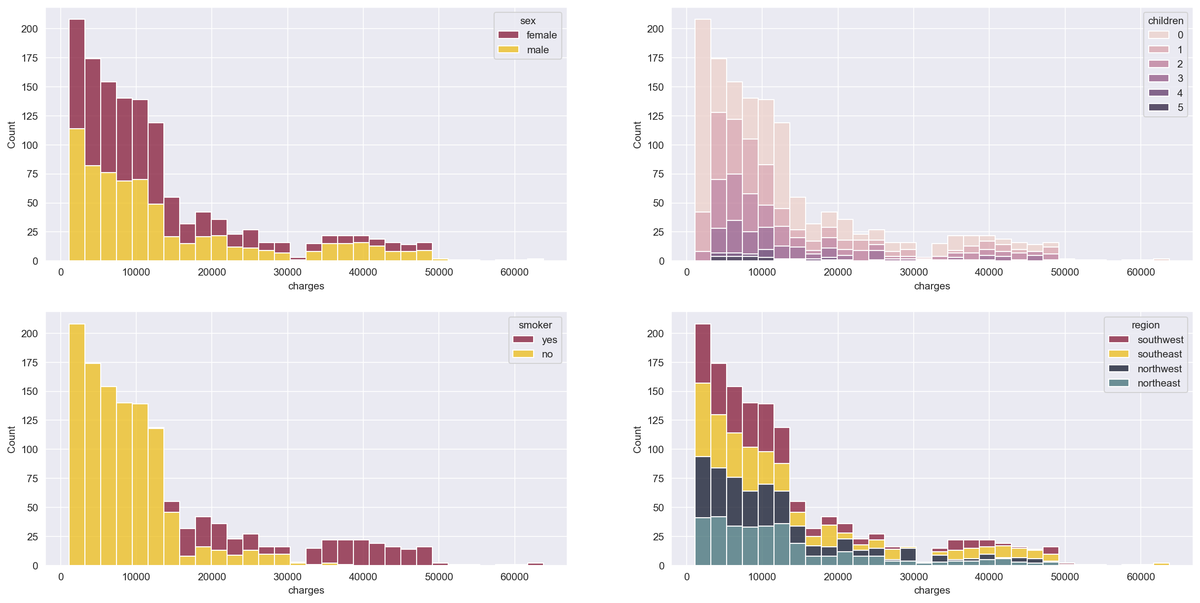
Smokers have significantly higher charges, and we can see that men have higher medical costs more often than women.
Now that we've gleaned some useful insight from EDA, let's begin the PyCaret process for regression on this data.
Initializing a PyCaret Environment
The setup() function of PyCaret initializes the environment and prepares the machine learning modeling data and deployment. There are two necessary parameters, a dataset, and the target variable. After executing the function, each feature's type is inferred, and several pre-processing tasks are performed on the data.
from pycaret.regression import *
reg = setup(
data=data,
target='charges',
train_size=0.8,
session_id=10,
normalize=True,
transform_target=True
)| Description | Value | |
|---|---|---|
| 0 | session_id | 10 |
| 1 | Target | charges |
| 2 | Original Data | (1338, 7) |
| 3 | Missing Values | False |
| 4 | Numeric Features | 2 |
| 5 | Categorical Features | 4 |
| 6 | Ordinal Features | False |
| 7 | High Cardinality Features | False |
| 8 | High Cardinality Method | None |
| 9 | Transformed Train Set | (1070, 14) |
| 10 | Transformed Test Set | (268, 14) |
| 11 | Shuffle Train-Test | True |
| 12 | Stratify Train-Test | False |
| 13 | Fold Generator | KFold |
| 14 | Fold Number | 10 |
| 15 | CPU Jobs | -1 |
| 16 | Use GPU | False |
| 17 | Log Experiment | False |
| 18 | Experiment Name | reg-default-name |
| 19 | USI | bd4e |
| 20 | Imputation Type | simple |
| 21 | Iterative Imputation Iteration | None |
| 22 | Numeric Imputer | mean |
| 23 | Iterative Imputation Numeric Model | None |
| 24 | Categorical Imputer | constant |
| 25 | Iterative Imputation Categorical Model | None |
| 26 | Unknown Categoricals Handling | least_frequent |
| 27 | Normalize | True |
| 28 | Normalize Method | zscore |
| 29 | Transformation | False |
| 30 | Transformation Method | None |
| 31 | PCA | False |
| 32 | PCA Method | None |
| 33 | PCA Components | None |
| 34 | Ignore Low Variance | False |
| 35 | Combine Rare Levels | False |
| 36 | Rare Level Threshold | None |
| 37 | Numeric Binning | False |
| 38 | Remove Outliers | False |
| 39 | Outliers Threshold | None |
| 40 | Remove Multicollinearity | False |
| 41 | Multicollinearity Threshold | None |
| 42 | Clustering | False |
| 43 | Clustering Iteration | None |
| 44 | Polynomial Features | False |
| 45 | Polynomial Degree | None |
| 46 | Trignometry Features | False |
| 47 | Polynomial Threshold | None |
| 48 | Group Features | False |
| 49 | Feature Selection | False |
| 50 | Features Selection Threshold | None |
| 51 | Feature Interaction | False |
| 52 | Feature Ratio | False |
| 53 | Interaction Threshold | None |
| 54 | Transform Target | True |
| 55 | Transform Target Method | box-cox |
After running the setup() function on our data, the results display the pre-processing pipeline applied to the dataset. Some highlights of this pipeline are:
1. Inferred data types
We can see that four features have been correctly identified as categorical, and the rest as numerical. In case PyCaret fails to do that correctly, we can define them in the setup() function ourselves, using the categorical_features and numeric_features parameters.
2. Train/Test Split The dataset has been split into a train and test set, as it is standard practice in machine learning. The train set size has been set to 80% of the original dataset, meaning that 80% of the data will be used to train the machine learning model and the rest for testing its accuracy.
3. Normalization of Numerical Features Many regression algorithms that require the features to be normalized for them to work as expected. Normalized features have $μ = 0$ and $σ = 1$. The standard method to accomplish that is to replace each value with its associated z-score, which is defined as $z = \frac{x-μ}{σ}$ .
4. One-Hot Encoding of Categorical Features Some machine learning algorithms that accept categorical features and some that don't, so it is best to convert them to numerical features using one-hot encoding. One-hot encoding removes the categorical features and replaces them with additional binary variables, one for each category, minus one (to avoid the dummy variable trap).
5. Target Transformation As we've noticed in the EDA section, the target variable is right-skewed. This could cause problems as many regression algorithms expect the data to have a normal distribution to perform optimally. The setup() function includes the option to transform the target to have a distribution close to normal. Transformations can also be applied to the features if needed, but it was unnecessary in this case.
There are various other advanced parameters in the setup() function, so if you're curious, feel free to check out the relevant section of their docs that goes over each piece in detail.
Viewing the pre-processed data
The get_config('X') function returns the features dataset after the pre-processing pipeline has been applied to it:
get_config('X')| age | bmi | sex_female | children_0 | children_1 | children_2 | children_3 | children_4 | children_5 | smoker_no | region_northeast | region_northwest | region_southeast | region_southwest | |
|---|---|---|---|---|---|---|---|---|---|---|---|---|---|---|
| 0 | -1.423959 | -0.457049 | 1.0 | 1.0 | 0.0 | 0.0 | 0.0 | 0.0 | 0.0 | 0.0 | 0.0 | 0.0 | 0.0 | 1.0 |
| 1 | -1.494665 | 0.498336 | 0.0 | 0.0 | 1.0 | 0.0 | 0.0 | 0.0 | 0.0 | 1.0 | 0.0 | 0.0 | 1.0 | 0.0 |
| 2 | -0.787608 | 0.373013 | 0.0 | 0.0 | 0.0 | 0.0 | 1.0 | 0.0 | 0.0 | 1.0 | 0.0 | 0.0 | 1.0 | 0.0 |
| 3 | -0.434080 | -1.302572 | 0.0 | 1.0 | 0.0 | 0.0 | 0.0 | 0.0 | 0.0 | 1.0 | 0.0 | 1.0 | 0.0 | 0.0 |
| 4 | -0.504786 | -0.297547 | 0.0 | 1.0 | 0.0 | 0.0 | 0.0 | 0.0 | 0.0 | 1.0 | 0.0 | 1.0 | 0.0 | 0.0 |
| ... | ... | ... | ... | ... | ... | ... | ... | ... | ... | ... | ... | ... | ... | ... |
| 1333 | 0.767917 | 0.042616 | 0.0 | 0.0 | 0.0 | 0.0 | 1.0 | 0.0 | 0.0 | 1.0 | 0.0 | 1.0 | 0.0 | 0.0 |
| 1334 | -1.494665 | 0.197235 | 1.0 | 1.0 | 0.0 | 0.0 | 0.0 | 0.0 | 0.0 | 1.0 | 1.0 | 0.0 | 0.0 | 0.0 |
| 1335 | -1.494665 | 0.999627 | 1.0 | 1.0 | 0.0 | 0.0 | 0.0 | 0.0 | 0.0 | 1.0 | 0.0 | 0.0 | 1.0 | 0.0 |
| 1336 | -1.282548 | -0.798839 | 1.0 | 1.0 | 0.0 | 0.0 | 0.0 | 0.0 | 0.0 | 1.0 | 0.0 | 0.0 | 0.0 | 1.0 |
| 1337 | 1.545679 | -0.266623 | 1.0 | 1.0 | 0.0 | 0.0 | 0.0 | 0.0 | 0.0 | 0.0 | 0.0 | 1.0 | 0.0 | 0.0 |
1338 rows × 14 columns
We can see that the numerical features have been normalized with the z-score method, and the categorical features have been encoded with one-hot encoding. It is important to verify that the pre-processing has been completed successfully, as in some cases, our dataset might not be as clean as the one used in this example. In case the pre-processing pipeline fails, we may get incorrect and unexpected results from the machine learning models.
Comparing Different Models
There are numerous regression algorithms available, and it is not always obvious which one is optimal for our dataset. The only way to find the best model is to test a number of them and compare the results. Fortunately, PyCaret provides the compare_models() function, which compares a variety of different models easily:
best = compare_models(sort='RMSE')| Model | MAE | MSE | RMSE | R2 | RMSLE | MAPE | TT (Sec) | |
|---|---|---|---|---|---|---|---|---|
| gbr | Gradient Boosting Regressor | 2049.5818 | 20421350.9926 | 4370.9223 | 0.8629 | 0.3560 | 0.1638 | 0.0160 |
| rf | Random Forest Regressor | 2148.1937 | 20860760.2193 | 4463.4103 | 0.8585 | 0.3816 | 0.1857 | 0.0560 |
| lightgbm | Light Gradient Boosting Machine | 2320.8815 | 21164314.7458 | 4491.1725 | 0.8568 | 0.3771 | 0.1910 | 0.0550 |
| catboost | CatBoost Regressor | 2272.1176 | 21920375.9207 | 4552.2118 | 0.8525 | 0.3685 | 0.1737 | 0.7090 |
| ada | AdaBoost Regressor | 3028.9828 | 22202851.6593 | 4619.7146 | 0.8498 | 0.4583 | 0.3918 | 0.0110 |
| et | Extra Trees Regressor | 2290.2154 | 24332567.3742 | 4858.0821 | 0.8341 | 0.4075 | 0.2014 | 0.0490 |
| xgboost | Extreme Gradient Boosting | 2782.4022 | 35645139.9000 | 5681.2366 | 0.7593 | 0.4167 | 0.2362 | 0.0950 |
| dt | Decision Tree Regressor | 2883.4270 | 38905351.2137 | 6207.1844 | 0.7276 | 0.4946 | 0.3120 | 0.0050 |
| omp | Orthogonal Matching Pursuit | 5700.3404 | 59762727.6470 | 7668.1283 | 0.5919 | 0.6876 | 0.6901 | 0.0070 |
| ridge | Ridge Regression | 4081.9423 | 63909181.2000 | 7873.9212 | 0.5655 | 0.4260 | 0.2620 | 0.0050 |
| br | Bayesian Ridge | 4088.1831 | 64170144.6909 | 7889.7825 | 0.5637 | 0.4259 | 0.2620 | 0.0050 |
| lar | Least Angle Regression | 4106.0225 | 64908348.6235 | 7935.2674 | 0.5587 | 0.4259 | 0.2619 | 0.0060 |
| lr | Linear Regression | 4106.0354 | 64908770.4000 | 7935.2942 | 0.5587 | 0.4259 | 0.2619 | 0.0080 |
| huber | Huber Regressor | 4245.0332 | 81231444.5110 | 8865.0706 | 0.4478 | 0.4356 | 0.2068 | 0.0080 |
| knn | K Neighbors Regressor | 4982.9582 | 81987651.9475 | 8946.7009 | 0.4452 | 0.5405 | 0.3290 | 0.0120 |
| par | Passive Aggressive Regressor | 6250.5322 | 114585710.1368 | 10361.4084 | 0.2406 | 0.6238 | 0.5523 | 0.0060 |
| en | Elastic Net | 8276.7225 | 165075368.0000 | 12754.6845 | -0.1198 | 0.9128 | 0.9605 | 0.0050 |
| llar | Lasso Least Angle Regression | 8385.7427 | 166526887.1876 | 12811.0623 | -0.1297 | 0.9245 | 0.9895 | 0.0060 |
| lasso | Lasso Regression | 8385.7422 | 166526895.2000 | 12811.0627 | -0.1297 | 0.9245 | 0.9895 | 0.0080 |
After running the compare_models() function, the results are displayed. This table may seem intimidating, but it's actually fairly simple to understand. The first column contains each model's name, and the rest of the columns are various metrics.
You can focus on RMSE for now, which stands for Root Mean Squared Error. RMSE is a widely used metric for regression, and it is defined as the square root of the averaged squared difference between the actual value and the one predicted by the model:
$RMSE = \sqrt{ \frac{1}{N}\sum_{i=1}^{N} ( x_{i} - \hat{x_{i}} )^2 }$
The lower the RMSE value, the more accurate our model is. In this case, the best model is the Gradient Boosting Regressor model, with an RMSE value of 4368.4047.
Creating a model with PyCaret
The create_model() function lets you create a regression model based on the algorithm of your preference. In this case, we'll use Gradient Boosting Regressor since it had the best performance from compare_models() above.
The create_model() function uses k-fold cross-validation to evaluate the model accuracy. In this method, the dataset is first partitioned into $k$ subsamples, one subsample is retained for validation, and the rest is used to train the model. This process is repeated $k$ times, and each subsample is used only once as validation data.
model = create_model('gbr', cross_validation=True, fold=10)| MAE | MSE | RMSE | R2 | RMSLE | MAPE | |
|---|---|---|---|---|---|---|
| 0 | 1153.5021 | 3234575.3253 | 1798.4925 | 0.9704 | 0.2460 | 0.1493 |
| 1 | 2726.0526 | 31665967.0393 | 5627.2522 | 0.7558 | 0.4797 | 0.1887 |
| 2 | 2378.3264 | 29063760.2546 | 5391.0815 | 0.8309 | 0.3298 | 0.1569 |
| 3 | 2079.7411 | 21902085.8132 | 4679.9664 | 0.8806 | 0.4493 | 0.1497 |
| 4 | 1791.8977 | 17011091.0753 | 4124.4504 | 0.8976 | 0.3362 | 0.1576 |
| 5 | 1521.1686 | 9602958.3059 | 3098.8640 | 0.9157 | 0.2453 | 0.1530 |
| 6 | 1971.6365 | 15482810.4199 | 3934.8203 | 0.8652 | 0.3269 | 0.1721 |
| 7 | 2608.5165 | 31293027.6163 | 5594.0171 | 0.8249 | 0.4281 | 0.1597 |
| 8 | 2300.7854 | 25535340.4020 | 5053.2505 | 0.8118 | 0.4252 | 0.1699 |
| 9 | 1964.1911 | 19421893.6738 | 4407.0278 | 0.8760 | 0.2937 | 0.1813 |
| Mean | 2049.5818 | 20421350.9926 | 4370.9223 | 0.8629 | 0.3560 | 0.1638 |
| SD | 458.6997 | 8928114.5410 | 1147.3402 | 0.0571 | 0.0801 | 0.0129 |
After training the model, the cross-validation results are displayed. We set folds ($k$) to 10, so in this case, we have a ten-fold cross-validation. We can see the metrics for every fold, and the mean and standard deviation of all steps.
If you've used sklearn before, you'll notice that one line of code with PyCaret is equivalent to several lines with sklearn.
Tuning a Model
The tune_model() function tunes the hyperparameters of a given model and outputs the results. Hyperparameters are model settings that can be modified and can have either a positive or negative effect in their accuracy.
tune_model() uses the Random Grid Search method to tune and optimize the model by testing a random sample of the hyperparameters. We can define a grid with specific values for the hyperparameters by using the custom_grid parameter.
We can also define the number of iterations with the n_iter parameter. A random value from the defined grid of hyperparameters is selected for every iteration and tested using k-fold cross-validation.
params = {
'learning_rate': [0.01, 0.1],
'max_depth': [5, 6, 7, 8],
'subsample': [0.6, 0.7, 0.8],
'n_estimators' : [100, 300, 400, 500]
}
tuned_model = tune_model(
model,
optimize='RMSE',
fold=10,
custom_grid=params,
n_iter=20
)| MAE | MSE | RMSE | R2 | RMSLE | MAPE | |
|---|---|---|---|---|---|---|
| 0 | 1245.5549 | 4026621.4141 | 2006.6443 | 0.9631 | 0.2423 | 0.1569 |
| 1 | 2583.1972 | 30189293.0509 | 5494.4784 | 0.7672 | 0.4800 | 0.1834 |
| 2 | 2442.0266 | 30135598.8806 | 5489.5900 | 0.8247 | 0.3410 | 0.1730 |
| 3 | 1997.9252 | 21734060.8504 | 4661.9804 | 0.8816 | 0.4503 | 0.1487 |
| 4 | 1946.5765 | 16879740.1085 | 4108.4961 | 0.8984 | 0.3409 | 0.1819 |
| 5 | 1488.9834 | 9451504.0446 | 3074.3299 | 0.9170 | 0.2606 | 0.1656 |
| 6 | 2025.9735 | 15546849.0444 | 3942.9493 | 0.8646 | 0.3295 | 0.1775 |
| 7 | 2387.5058 | 28945218.9003 | 5380.0761 | 0.8381 | 0.4243 | 0.1528 |
| 8 | 2317.8041 | 26198464.5189 | 5118.4436 | 0.8069 | 0.4456 | 0.1837 |
| 9 | 1843.0738 | 17015176.7972 | 4124.9457 | 0.8914 | 0.2845 | 0.1729 |
| Mean | 2027.8621 | 20012252.7610 | 4340.1934 | 0.8653 | 0.3599 | 0.1696 |
| SD | 404.6465 | 8560903.9358 | 1083.9623 | 0.0545 | 0.0807 | 0.0123 |
As we can see from the cross-validation results, the hyperparameter tuning slightly increased the model's accuracy. The improvement is small, but experimenting with a higher iteration number or a grid with different hyperparameter values may lead to better results.
Plotting the Model Performance
PyCaret includes a plot_model() function that lets us visualize our model's accuracy and other properties. The function includes a variety of plots that help us evaluate and understand our model better. Compared to the underlying libraries used to generate these plots — sklearn, pandas, and matplotlib — using PyCaret is significantly quicker and simpler to work with.
First, we'll plot the error of the predictions on the test set:
plot_model(tuned_model, plot='error')Second, we'll plot the importance of each feature:
plot_model(tuned_model, plot='feature')In the EDA section above, we saw that being a smoker leads to significantly higher insurance charges, and now from the feature importance chart we see that being a smoker has the highest predictive value. Furthermore, we can also see that age and BMI seem to play an important role as well.
Making Predictions on New Data
Every real-world machine learning project's ultimate goal is to make predictions on new data, where the target variable is unknown. You can accomplish that by using the predict_model() function, which returns a pandas dataframe with predictions.
We are going to create a small synthetic dataset and test our model and see how it predicts insurance charges:
cols = ['age', 'sex', 'bmi', 'children', 'smoker', 'region']
records = [
[30, 'male', 20, 0, 'no', 'southeast'],
[30, 'male', 20, 0, 'yes', 'southeast'],
[30, 'male', 35, 0, 'yes', 'southeast'],
[70, 'male', 35, 0, 'yes', 'southeast'],
[30, 'female', 20, 0, 'no', 'southeast'],
[30, 'female', 20, 0, 'yes', 'southeast'],
[30, 'female', 35, 0, 'yes', 'southeast'],
[70, 'female', 35, 0, 'yes', 'southeast']
]
new_data = pd.DataFrame(data=records, columns=cols)
predict_model(tuned_model, new_data)| age | sex | bmi | children | smoker | region | Label | |
|---|---|---|---|---|---|---|---|
| 0 | 30 | male | 20 | 0 | no | southeast | 4043.350231 |
| 1 | 30 | male | 20 | 0 | yes | southeast | 17007.642015 |
| 2 | 30 | male | 35 | 0 | yes | southeast | 35749.960178 |
| 3 | 70 | male | 35 | 0 | yes | southeast | 45790.897563 |
| 4 | 30 | female | 20 | 0 | no | southeast | 4503.047383 |
| 5 | 30 | female | 20 | 0 | yes | southeast | 17208.037478 |
| 6 | 30 | female | 35 | 0 | yes | southeast | 35853.324929 |
| 7 | 70 | female | 35 | 0 | yes | southeast | 45870.135872 |
We can see that young non-smokers with a low BMI are predicted to have the lowest charges by our model. On the other hand, those who are older, obese, and smoke are predicted to be charged ten times as much. Those results are in line with the EDA and the feature importance plot.
Interpreting the Model
The ability to interpret a machine learning model's results allows you to avoid relying on a "black box model," where you don't understand how it exactly works.
PyCaret includes the interpret_model() function that provides an interpretation plot for a given model. This function requires the SHAP (SHapley Additive exPlanations) library to work, so we'll have to install it first.
pip install shapAfter installing the SHAP library, we can create an interpretation plot for our model. The Gradient Boosting Regressor isn't supported by the interpret_model() function, so we will create another model based on the XGBoost algorithm and interpret that model instead.
To interpret the model, we'll use the "reason" plot type:
xgb = create_model('xgboost', cross_validation=True, verbose=False)
interpret_model(xgb, plot='reason', observation=32)Above the plot, you'll notice the "base value," which is defined as the mean predicted target, and f(x), which is the prediction for a selected observation. The red-colored features increased the predicted value, while the blue-colored features decreased it.
The size of each feature indicates the impact it has on the model. In this case, not being a smoker and having zero children had a positive effect, and as a result, decreased the predicted insurance charges below the mean value.
Conclusion
We have pre-processed our data, compared a variety of regression models, and tuned the model of our preference, all in a few lines of code. Using scikit-learn for regression is, of course, an option, but the time and effort required are significantly higher. PyCaret lets us create machine learning models quickly and easily, making it an ideal choice for beginners. Furthermore, PyCaret can also be used by experienced data scientists who want to reduce the time needed to complete machine learning projects.
There's many other machine learning tasks you can accomplish with PyCaret, so definitely check out their docs.
Meet the Authors

Giannis Tolios is passionate about data science, machine learning and other cutting-edge technologies. He is currently offering his services as a freelancer, and his goal is to work on projects that utilize AI to mitigate climate change, economic inequality, and help achieve the UN sustainable development goals. Giannis was excited to join LearnDataSci as an author, because he is always eager to share his knowledge and expertise with others!