
CS & Engineering Post Graduate

Founder of LearnDataSci
K-Means & Other Clustering Algorithms: A Quick Intro with Python
Unsupervised learning via clustering algorithms. Let's work with the Karate Club dataset to perform several types of clustering algorithms.
LearnDataSci is reader-supported. When you purchase through links on our site, earned commissions help support our team of writers, researchers, and designers at no extra cost to you.
You should already know:
- Beginner Python
- Data science packages (pandas, matplotlib, seaborn, sklearn)
These can be learned interactively through DataCamp
You will learn:
- Clustering: K-Means, Agglomerative, Spectral, Affinity Propagation
- How to plot networks
- How to evaluate different clustering techniques
Clustering is the grouping of objects together so that objects belonging in the same group (cluster) are more similar to each other than those in other groups (clusters). In this intro cluster analysis tutorial, we'll check out a few algorithms in Python so you can get a basic understanding of the fundamentals of clustering on a real dataset.
Article Resources
- Source code: Github.
- Dataset: available via
networkxlibrary (see code below), also see paper: An Information Flow Model for Conflict and Fission in Small Groups
The Dataset
For the clustering problem, we will use the famous Zachary’s Karate Club dataset. For more detailed information on the study see the linked paper.
Essentially there was a karate club that had an administrator “John A” and an instructor “Mr. Hi”, and a conflict arose between them which caused the students to split into two groups; one that followed John and one that followed Mr. Hi.
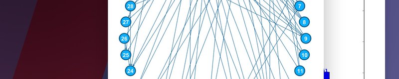
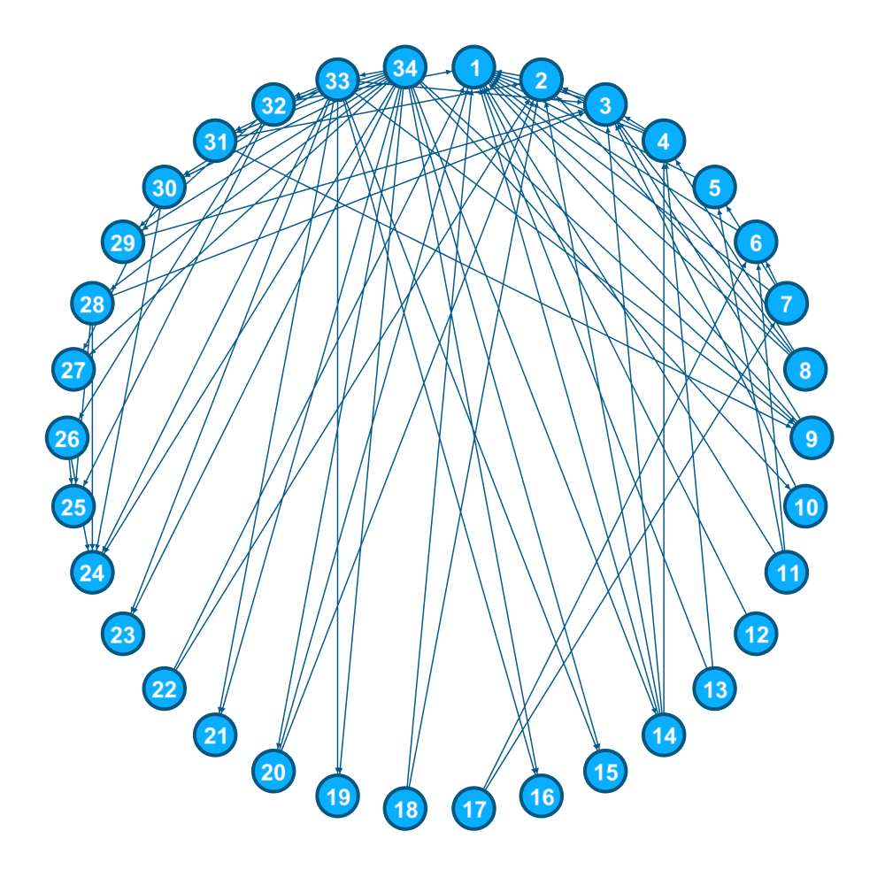
The students are the nodes in our graph, and the edges, or links, between the nodes are the result of social interactions outside of the club between students.
Since there was an eventual split into two groups (clusters) by the end of the karate club dispute, and we know which group each student ended up in, we can use the results as truth values for our clustering to gauge performance between different algorithms.
Getting Started with Clustering in Python
Imports for this tutorial
from sklearn import cluster
import networkx as nx
from collections import defaultdict
import matplotlib.pyplot as plt
from matplotlib import cm
import seaborn as sns
import pandas as pd
import numpy as np
from sklearn.metrics.cluster import normalized_mutual_info_score
from sklearn.metrics.cluster import adjusted_rand_scoreWe'll be using the scikit-learn, pandas , and numpy stack with the addition of matplotlib, seaborn and networkx for graph visualization. A simple pip/conda install should work with each of these.
Let's go ahead and import the dataset directly from networkx and also set up the spring layout positioning for the graph visuals:
G = nx.karate_club_graph()
pos = nx.spring_layout(G)Let's go ahead a create a function to let us visualize the dataset:
def draw_communities(G, membership, pos):
"""Draws the nodes to a plot with assigned colors for each individual cluster
Parameters
----------
G : networkx graph
membership : list
A list where the position is the student and the value at the position is the student club membership.
E.g. `print(membership[8]) --> 1` means that student #8 is a member of club 1.
pos : positioning as a networkx spring layout
E.g. nx.spring_layout(G)
"""
fig, ax = plt.subplots(figsize=(16,9))
# Convert membership list to a dict where key=club, value=list of students in club
club_dict = defaultdict(list)
for student, club in enumerate(membership):
club_dict[club].append(student)
# Normalize number of clubs for choosing a color
norm = colors.Normalize(vmin=0, vmax=len(club_dict.keys()))
for club, members in club_dict.items():
nx.draw_networkx_nodes(G, pos,
nodelist=members,
node_color=cm.jet(norm(club)),
node_size=500,
alpha=0.8,
ax=ax)
# Draw edges (social connections) and show final plot
plt.title("Zachary's Karate Club")
nx.draw_networkx_edges(G, pos, alpha=0.5, ax=ax)In order to color the student nodes according to their club membership, we're using matplotlib's Normalize class to fit the number of clubs into the (0, 1) interval. You might be wondering why we need to do this when there's only two clubs that resulted from the study, but we'll find out later that some clustering algorithms didn't get it right and we need to be able to colorize more than two clubs.
To compare our algorithm's, performance we want the true labels, i.e. where each student ended up after the club fission. Unfortunately, the true labels are not provided in the networkx dataset, but we can retrieve them from the study itself and hardcode them here:
# True labels of the group each student (node) unded up in. Found via the original paper
y_true = [0, 0, 0, 0, 0, 0, 0, 0, 1, 1, 0, 0, 0, 0, 1, 1, 0, 0, 1, 0, 1, 0, 1, 1, 1, 1, 1, 1, 1, 1, 1, 1, 1, 1]Now, let's use our draw function to visualize the true student club membership and their social connections:
draw_communities(G, y_true, pos)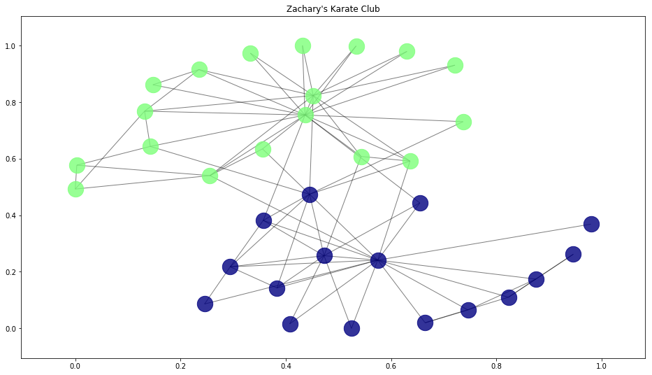
This is the true division of the Karate Club. We'll see how our algorithms do when trying to cluster on their own below.
Before that, we need to preprocess the data by transforming the graph into a matrix since that is the format required for the clusterers. Remember this edge_mat variable below, we'll be using this for input to our clustering models in the next few sections:
def graph_to_edge_matrix(G):
"""Convert a networkx graph into an edge matrix.
See https://www.wikiwand.com/en/Incidence_matrix for a good explanation on edge matrices
Parameters
----------
G : networkx graph
"""
# Initialize edge matrix with zeros
edge_mat = np.zeros((len(G), len(G)), dtype=int)
# Loop to set 0 or 1 (diagonal elements are set to 1)
for node in G:
for neighbor in G.neighbors(node):
edge_mat[node][neighbor] = 1
edge_mat[node][node] = 1
return edge_matLet's transform our graph into a matrix and print the result to see what it contains:
edge_mat = graph_to_edge_matrix(G)
edge_mat
"""
array([[1, 1, 1, ..., 1, 0, 0],
[1, 1, 1, ..., 0, 0, 0],
[1, 1, 1, ..., 0, 1, 0],
...,
[1, 0, 0, ..., 1, 1, 1],
[0, 0, 1, ..., 1, 1, 1],
[0, 0, 0, ..., 1, 1, 1]])
"""Clustering Algorithms
Unsupervised learning via clustering can work quite well in a lot of cases, but it can also perform terribly. We'll go through a few algorithms that are known to perform very well and see how the do on the same dataset. Fortunately, we can use the true cluster labels from the paper to calculate metrics and determine which is the best clustering option.
K-Means Clustering
K-means is considered by many to be the gold standard when it comes to clustering due to its simplicity and performance, so it's the first one we'll try out.
When you have no idea at all what algorithm to use, K-means is usually the first choice.
K-means works by defining spherical clusters that are separable in a way so that the mean value converges towards the cluster center. Because of this, K-Means may underperform sometimes.
To simply construct and train a K-means model, we can use sklearn's package. Before we do, we are going to define the number of clusters we know to be true (two), a list to hold results (labels), and a dictionary containing each algorithm we end up trying:
k_clusters = 2
results = []
algorithms = {}
algorithms['kmeans'] = cluster.KMeans(n_clusters=k_clusters, n_init=200)To fit this model, we could simply call algorithms['kmeans'].fit(edge_mat).
Since we'll be testing a bunch of clustering packages, we can loop over each and fit them at the same time. See below.
Agglomerative Clustering
The main idea behind Agglomerative clustering is that each node first starts in its own cluster, and then pairs of clusters recursively merge together in a way that minimally increases a given linkage distance.
The main advantage of Agglomerative clustering (and hierarchical clustering in general) is that you don’t need to specify the number of clusters. That of course, comes with a price: performance. But, in sklearn’s implementation, you can specify the number of clusters to assist the algorithm’s performance.
You can find a lot more information about how this technique works mathematically here.
Let's create and train an agglomerative model and add it to our dictionary:
algorithms['agglom'] = cluster.AgglomerativeClustering(n_clusters=k_clusters, linkage="ward")Spectral Clustering
The Spectral clustering technique applies clustering to a projection of the normalized Laplacian. When it comes to image clustering, Spectral clustering works quite well.
algorithms['spectral'] = cluster.SpectralClustering(n_clusters=k_clusters, affinity="precomputed", n_init=200)Affinity Propagation
Affinity propagation is a bit different. Unlike the previous algorithms, this one does not require the number of clusters to be determined before running the algorithm.
Affinity propagation performs really well on several computer vision and biology problems, such as clustering pictures of human faces and identifying regulated transcripts, but we'll soon find out it doesn't work well for our dataset.
Let's add this final algorithm to our dictionary and wrap it all up by fitting each model:
algorithms['affinity'] = cluster.AffinityPropagation(damping=0.6)
# Fit all models
for model in algorithms.values():
model.fit(edge_mat)
results.append(list(model.labels_))Metrics & Plotting
Well, it is time to choose which algorithm is more suitable for our data. A simple visualization of the result might work on small datasets, but imagine a graph with one thousand, or even ten thousand, nodes. That would be slightly chaotic for the human eye. So, let calculate the Adjusted Rand Score (ARS) and the Normalized Mutual Information (NMI) metrics for easier interpretation.
Normalized Mutual Information (NMI)
Mutual Information of two random variables is a measure of the mutual dependence between the two variables. Normalized Mutual Information is a normalization of the Mutual Information (MI) score to scale the results between 0 (no mutual information) and 1 (perfect correlation). In other words, 0 means dissimilar and 1 means
a perfect match.
Adjusted Rand Score (ARS)
Adjusted Rand Score on the other hand, computes a similarity measure between two clusters. ARS considers all pairs of samples and counts pairs that are assigned in the same or different clusters in the predicted and true clusters.
If that's a little weird to think about, have in mind that, for now, 0 is the lowest similarity and 1 is the highest.
In order to plot our scores, let's first calculate them. Remember that y_true is still a dictionary where the key is a student and the value is the club they ended up in. We need to get y_true's values first in order to compare them to y_pred:
nmi_results = []
ars_results = []
y_true_val = list(y_true.values()
# Append the results into lists
for y_pred in results:
nmi_results.append(normalized_mutual_info_score(y_true_val, y_pred))
ars_results.append(adjusted_rand_score(y_true_val, y_pred))Let's now plot both scores side-by-side along with their averages for a better comparison.
We're using Seaborn's barplot along with matplotlib just for simpler coloring syntax. Most of the following is pretty simple.
The only thing fancy we added was the text on top of the bars. This is achieved on each subplot by referencing each axes (subplot), then using the index (i) as the x-coordinate, the score (v) as the y-coordinate, followed by the rounded value of v as the actual text to show on top.
fig, (ax1, ax2, ax3) = plt.subplots(1, 3, sharey=True, figsize=(16, 5))
x = np.arange(len(y))
avg = [sum(x) / 2 for x in zip(nmi_results, ars_results)]
xlabels = list(algorithms.keys())
sns.barplot(x, nmi_results, palette='Blues', ax=ax1)
sns.barplot(x, ars_results, palette='Reds', ax=ax2)
sns.barplot(x, avg, palette='Greens', ax=ax3)
ax1.set_ylabel('NMI Score')
ax2.set_ylabel('ARS Score')
ax3.set_ylabel('Average Score')
# # Add the xlabels to the chart
ax1.set_xticklabels(xlabels)
ax2.set_xticklabels(xlabels)
ax3.set_xticklabels(xlabels)
# Add the actual value on top of each bar
for i, v in enumerate(zip(nmi_results, ars_results, avg)):
ax1.text(i - 0.1, v[0] + 0.01, str(round(v[0], 2)))
ax2.text(i - 0.1, v[1] + 0.01, str(round(v[1], 2)))
ax3.text(i - 0.1, v[2] + 0.01, str(round(v[2], 2)))
# Show the final plot
plt.show()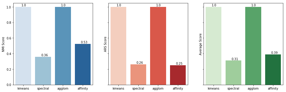
As you can see in the resulting chart, K-means and Agglomerative clustering have the best possible outcome for our dataset. That, of course, does not mean that Spectral and Agglomerative are low-performing algorithms, just that the did not fit in our particular dataset.
Out of curiosity, let's create a new function to plot where each algorithm went wrong by comparing the predicted student clusters with the true student clusters:
def draw_true_vs_pred(G, y_true, y_pred, pos, algo_name, ax):
for student, club in y_true.items():
if y_pred is not None:
if club == y_pred[student]:
node_color = [0, 1, 0]
node_shape = 'o'
else:
node_color = [0, 0, 0]
node_shape = 'X'
nx.draw_networkx_nodes(G, pos,
nodelist=[student],
node_color=node_color,
node_size=250,
alpha=0.7,
ax=ax,
node_shape=node_shape)
# Draw edges and show final plot
ax.set_title(algo_name)
nx.draw_networkx_edges(G, pos, alpha=0.5, ax=ax)
fig, ((ax1, ax2), (ax3, ax4)) = plt.subplots(2, 2, sharex=True, sharey=True, figsize=(10, 10))
for algo_name, ax in zip(algorithms.keys(), [ax1, ax2, ax3, ax4]):
draw_true_vs_pred(G, y_true, algorithms[algo_name].labels_, pos, algo_name, ax)
This graph depicts each algorithm's correct (green circle) and incorrect (black X) cluster assignments.
Interestingly, we see that although the Affinity algorithm had a higher average score, it only put one node in the correct cluster.
To see the reason why, we can look at the cluster information from that algorithm:
cluster_centers_indices = algorithms['affinity'].cluster_centers_indices_
n_clusters_ = len(cluster_centers_indices)
print(n_clusters_)
# 8Since we were not able to define the number of clusters for Affinity Propagation, it determined that there were eight clusters. Our metrics didn't hint at this problem since our scoring wasn't based off of clustering accuracy.
Let's wrap it up but taking a look at what our Affinity algorithm actually clustered:
# The resulting clubs
algorithms['affinity'].labels_
# array([0, 2, 2, 2, 1, 1, 1, 2, 4, 3, 1, 1, 2, 2, 4, 4, 1, 2, 4, 4, 4, 2, 4, 5, 5, 6, 3, 3, 6, 4, 5, 7, 7], dtype=int64)
draw_communities(G, algorithms['affinity'].labels_, pos)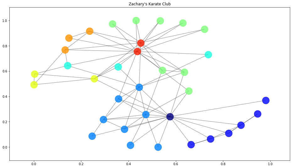
Final Words
Thanks for joining us in this clustering introduction. I hope you found some value in seeing how we can easily manipulate a public dataset and apply and compare several different clustering algorithms using sklearn in Python. If you're interested in getting a more in-depth, theoretical understanding of clustering, consider taking a machine learning course.
If you have any questions, definitely let us know in the comments below.
Continue learning
Machine Learning with Python — Coursera
Week four of this course has several great lectures about clustering to give you a more in-depth understanding.
Meet the Authors

LearnDataSci Author, postgraduate in Computer Science & Engineering at the University Ioannina, Greece, and Computer Science undergraduate teaching assistant.