

Data Scientist
Applied Dimensionality Reduction — 3 Techniques using Python
You should already know:
You should be comfortable with Python and have some experience with pandas, scikit-learn, and matplotlib. You can learn these interactively on Dataquest.
You will learn:
- What dimensionality is and why you should care about reducing it
- When, why, and how to use the most common dimensionality reduction techniques
- How to use Python to reduce the dimensionality of a dataset with PCA, t-SNE, and UMAP
Introduction
The dimensionality of a dataset refers to its features, attributes, or variables. When we are talking about tabular data residing in spreadsheets, the dimensions are defined as columns. For an RGB image, the dimensions are the color intensity values of each pixel.
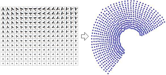
To understand the usefulness of dimensionality reduction, consider a dataset that contains images of the letter A (Figure 1), which has been scaled and rotated with varying intensity. Each image has $32 \times 32$ pixels, aka $32 \times 32=1024$ dimensions.
However, the actual dataset's dimensions are only two because only two variables (rotation and scale) have been used to produce the data. Successful Dimensionality Reduction will discard the correlated information (letter A) and recover only the variable information (rotation and scale).
It is not uncommon for modern datasets to have thousands, if not millions, of dimensions. Usually, data with this many dimensions are very sparse, highly correlated, and therefore quite redundant. Dimensionality reduction aims to keep the essence of the data in a few representative variables. This helps make the data more intuitive both for us data scientists and for the machines.
Dimensionality reduction reduces the number of dimensions (also called features and attributes) of a dataset. It is used to remove redundancy and help both data scientists and machines extract useful patterns.
The goal of this article
In the first part of this article, we'll discuss some dimensionality reduction theory and introduce various algorithms for reducing dimensions in various types of datasets. The second part of this article walks you through a case study, where we get our hands dirty and use python to 1) reduce the dimensions of an image dataset and achieve faster training and predictions while maintaining accuracy, and 2) run PCA, t-SNE and UMAP to visualize our dataset.
The Curse of Dimensionality
The "curse of dimensionality" manifests itself in a multitude of ways in data science:
Distance is not a good measure of distinction in high dimensions. With high dimensionality, most data points end up far from each other. Therefore, many machine learning algorithms that rely on distance functions to measure data similarity cannot deal with high-dimensional data. This includes algorithms like K-Means, K-Nearest Neighbors (KNN).
Need for more data. Each feature increases the amount of data needed for estimation. A good rule of thumb is to have at least 10 examples for each feature in your dataset. For example, if your data has 100 features, you should have at least 1000 examples before searching for patterns.
Overfitting. A learning algorithm may find spurious correlations between the features and the target when you use too many features. Overfit models spuriously match the training data and do not generalize well to test data.
Combinatorial explosion. The search space becomes exponentially larger when you add more dimensions. Imagine the simple case where you only have binary features, meaning they only take the values of 0 and 1.
1 feature has 2 possible values
2 features have $2^2=4$ possible values
...
1000 features have $2^{1000} \approx 10^{300}$ possible values.
By comparison, there are only about by $10^{82}$ atoms in the entire universe (according to Universe Today. In other words, our data set contains way more possible values than there are atoms in the universe. Now consider that 1000 features are not much by today's standards and that binary features are an extreme oversimplification.
This combinatorial explosion gives two problems for data science:
- Quality of models. Traditional data science methods do not work well in such vast search spaces.
- Computability. It requires huge amounts of computation to find patterns in high dimensions.
Intuition
High dimensional data points are all far away from each other.
When you have hundreds or thousands of dimensions, points end up near the edges. It is counterintuitive in 2 or 3 dimensions where our brains live most of the time, but in a high-dimensional space, the idea of closeness as a measure of similarity breaks down.
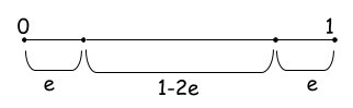
Let's gain this intuition! Think about the probability of a point ending up at the edge of a d-dimensional unit hypercube. That is the cube with $d$ dimensions with each edge having unit length ($length=1$). We’ll use the letter e to represent the degree of error (i.e., distance from the edge) we are willing to tolerate. . When any of the point's dimensions is "close" to 0 or 1, then the point lies at an edge. According to Figure 2, the probability of a dimension not ending close to 0 or 1 is $1-2e$.
The probability of all N dimensions not ending close to 0 or 1 (epsilon distance from 0 or 1) is $(1-2e)^d$. Let see what this means for a small $e=0.001$ for a varying number of dimensions.
| Dimensions (d) | Probability $(1-2*0.001)^d$ |
|---|---|
| 1 | $0.998$ |
| 2 | $0.998^2=0.996$ |
| 100 | $0.998^{100}=0.819$ |
| 1000 | $0.998^{1000}=0.135$ |
| 2000 | $0.998^{2000}=0.018$ |
When to use Dimensionality Reduction
Guided by the problems resulting from high dimensionality, we find the following reasons to use Dimensionality Reduction:
- Interpretability. It is not easy as a human to interpret your results when you are dealing with many dimensions. Imagine looking at a spreadsheet with a thousand columns to find differences between different rows. In medical or governmental applications, it can be a requirement for the results to be interpretable.
- Visualization. Somehow related to the previous, you might want to project your data to 2D or 3D to produce a visual representation. After all, an image is worth a thousand words.
- Reduce overfitting. A machine learning model can use each one of the dimensions as a feature to distinguish between other examples. This is a remedy against the Hughes phenomenon, which tells us that more features lead to worse model quality beyond a certain point.
- Scalability. Many algorithms do not scale well when the number of dimensions increases. Dimensionality Reduction can be used to ease the computations and find solutions in reasonable amounts of time.
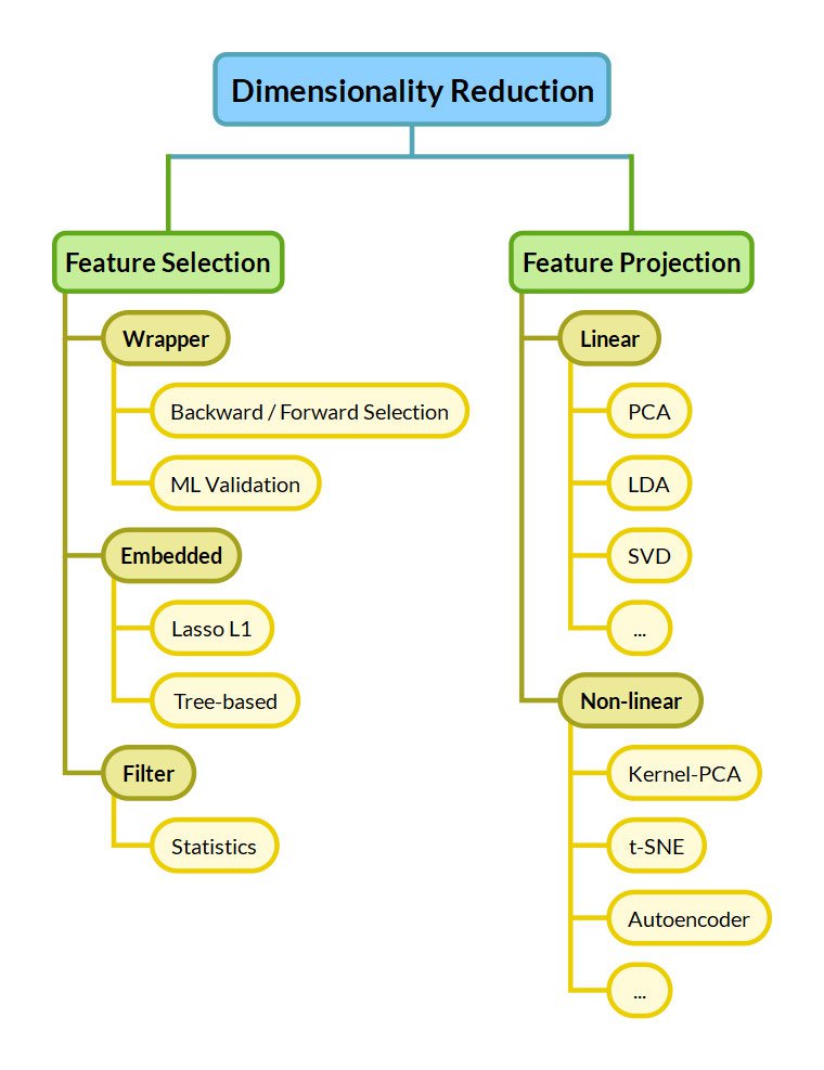
Taxonomy of Algorithms
Now that we've seen the problems with high-dimensionality, let's see the options we have to mitigate them. We distinguish between Feature Selection and Feature Projection approaches.
Feature Selection
Feature Selection keeps a subset of the dimensions belonging to the original dataset. This means selecting the "best" dimensions of a given dataset, keeping only some out of $n$ dimensions. Optimal feature selection requires us to examine all $2^n$ combinations, which is unmanageable for many applications.
Feature Selection techniques are commonly divided into 3 categories:
- Filter methods greedily eliminate features based on their statistics. An example of such a statistic could be the correlation to the target. Filter methods are the simplest and fastest approaches.
- Embedded methods are part of the predictive algorithm. For example, tree-based algorithms inherently score the dataset features and rank them based on importance. Lasso L1 regularization inherently eliminates redundant features by dropping their weight to zero.
- Wrapper methods use the predictive algorithm on a validation set with subsets of features to identify the most useful ones. Finding the optimal subset has a large computational cost. Wrapper methods make greedy decisions like backward/forward selection, which greedily eliminate/select features one after the other.
Feature Projection
Feature Projection — also called Feature Extraction or Feature Transformation — extracts "important" features by applying transformations to the original features. Depending on the type of the applied transformation, feature transformation approaches are further divided into Linear and Non-Linear:
- Linear methods linearly combine the original features to compress the original dataset into fewer dimensions. Common methods include the Principal Component Analysis (PCA), Linear Discriminant Analysis (LDA), and Singular Value Decomposition (SVD).
- Non-Linear methods are more complex but can find useful reductions of the dimensions where linear methods fail. Reducing the dimensionality to only rotation and scale for Figure 1 would not be possible for a linear method. Non-linear Dimensionality Reduction methods include the kernel PCA, t-SNE, Autoencoders, Self-Organizing Maps, IsoMap, and UMap.
Note
1: Keeping a subset of the original dimensions as in Feature Selection is a constraint that may be present for interpretability. While this is important for some applications, it is not the general case. When people talk about Dimensionality Reduction, they most commonly refer to Feature Projection approaches, and that's why we will focus on them in the rest of the article.
2: Dimensionality Reduction techniques as discussed here are often a preprocessing step to clustering methods for recognizing patterns.
Common Algorithms
We discuss some of the most common algorithms used for Dimensionality Reduction in the next subsections, namely PCA, Autoencoders, t-SNE, and UMAP.
Principal Component Analysis (PCA)
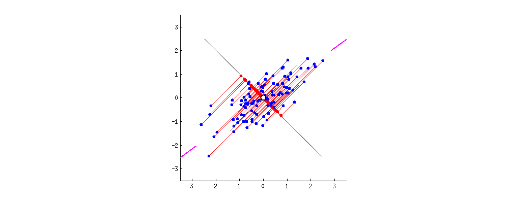 Figure 5: PCA projects the blue dots onto the line and maximizes the distance, or variance, between them. This line of best fit is the first principal component. [Source]
PCA is one the simplest and by far the most common method for Dimensionality Reduction. It can be thought of as a lossy compression method that linearly combines dimensions to reduce them, keeping as much of the dataset variance as possible. It reduces a dataset into its _Principal Components._ Without going into the math in this article, let's say that the Principal Components are the orthogonal directions along which the variance in the data is the greatest.
Note that features need to be scaled to all have the same variance (unit variance of 1) before using PCA. Otherwise, PCA will overestimate the importance of variables with large magnitude (see https://scikit-learn.org/stable/auto\_examples/preprocessing/plot\_scaling\_importance.html).
Practical Usage
In the next section, we explore the practical usage of PCA in our Case Study.
| Pros | Cons |
|---|---|
| Fast | Linear (useless with non-linear dependencies) |
| Simple | Too simple |
| Interpretable |
Autoencoders
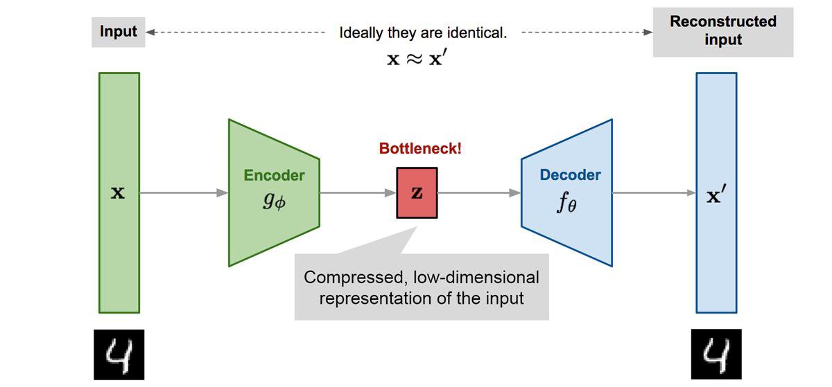
Autoencoders are unsupervised feedforward neural network architectures. They learn in an unsupervised way by forcing the network's output to approximate the input of the network ($X=X'$), as shown in Figure 6. They manage to learn something more interesting than the identity function due to some constraints in the network architecture. A common constraint is to enforce some part of the network to have fewer neurons than the input size ($|z|<|X|$). The embedding of the encoded layer can be used for non-linear dimensionality reduction.
Autoencoders are useful beyond dimensionality reduction. For example, denoising autoencoders are a special type that removes noise from data, being trained on data where noise has been artificially added. They have recently been in headlines with language models like BERT, which are a special type of denoising autoencoders.
| Pros | Cons |
|---|---|
| Non-Linear Dimensionality Reduction | Hard to train. May require Deep Learning knowledge |
| Can give state-of-the-art performance | Needs a lot of data (but without labels) |
| Not interpretable |
t-distributed Stochastic Neighbor Embedding (t-SNE)
t-SNE is a Machine Learning algorithm for visualizing high-dimensional data proposed by Laurens van der Maaten and Geoffrey Hinton (the same Hinton who got the 2018 Turing Award for his contribution to Deep Learning).
There is the notion that high-dimensional natural data lie in a low-dimensional manifold embedded in the high-dimensional space. From all the possible 32x32 images, a tiny percentage corresponds to images of digits, which forms manifold in the 32x32 space. t-SNE aims to preserve the topology of this manifold by preserving local distances when moving from high dimensions to low dimensions.
Practical Considerations
As a preprocessing step, it is highly recommended to use another dimensionality reduction method (e.g. PCA) to reduce the number of dimensions to a reasonable amount (e.g. 50). Otherwise, it may take too much time to converge.
For the choice of hyperparameters, like perplexity, I suggest reading the article "How to use t-SNE effectively."
Later in this article, we explore the practical usage of t-SNE in our Case Study.
The t-SNE method is part of scikit-learn's standard library, so you can easily give it a try.
| Pros | Cons |
|---|---|
| Good for visualization in 2D or 3D | Very computationally expensive |
| Only for visualization | |
| Stochastic, multiple restarts can have different results | |
| Not interpretable |
Uniform Manifold Approximation and Projection (UMAP)
According to the authors of UMAP, "The UMAP algorithm is competitive with t-SNE for visualization quality, and arguably preserves more of the global structure with superior run time performance. Furthermore, UMAP has no computational restrictions on embedding dimension, making it viable as a general purpose dimension reduction technique for machine learning."
Four things to note here:
- UMAP achieves comparable visualization performance with t-SNE.
- UMAP preserves more of the global structure. While the distance between the clusters formed in t-SNE does not have significant meaning, in UMAP the distance between clusters matters.
- UMAP is fast and can scale to Big Data.
- UMAP is not restricted for visualization-only purposes like t-SNE. It can serve as a general-purpose Dimensionality Reduction algorithm.
Basically, UMAP is the t-SNE killer for most practical cases.

Practical Considerations
The UMAP hyperparameters that need to be tuned to get good results:
- Minimum Distance
min_distcontrols how tightly UMAP is allowed to pack points together. Low values (close to 0) will give a good idea of the topological structure of the data, while large values (close to 1) will give more general features. - Number of neighbors
n_neighborsbalances the preservation of local versus global structure in the resulting embedding. It does this by constraining the size of the local neighborhood UMAP will look at when attempting to learn the manifold structure of the data. On the one hand, low values will force UMAP to look for local structure, missing the big picture. On the other hand, high values will get the big picture but miss the details.
More on the hyper-parameters of UMAP in the docs.
The python library umap-learn is fully compatible with scikit-learn and we'll see how to use it in the end of the case study.
| Pros | Cons |
|---|---|
| Fast and Scalable | Needs hyperparameter tuning |
| Good for visualization | Not interpretable |
| No limit in resulting dimension | |
| Preservers local and global structure |
Case Study
To demonstrate dimensionality reduction, we will use the well-known MNIST dataset that contains $28 \times 28$ images of handwritten digits. We will see that not all $28 \times 28 = 784$ features are needed to classify the digits.
Initially, we will demonstrate the use of PCA and how it can be important for the scalability of a downstream predictive algorithm like Support Vector Machines (SVM).
We then compare the usage of PCA and t-SNE for the 2D visualization of a high-dimensional dataset of images. We see how t-SNE can successfully unfold the low-dimensional manifold of handwritten digits that lies in the 784-dimensional space of $28 \times 28$ images. Lastly, we see how UMAP does the same job as t-SNE much faster, preserving global structure as an added bonus.
Import Libraries
We will be using the following libraries:
from keras.datasets import mnist
import matplotlib.pyplot as plt
import numpy as np
from time import time
from sklearn.svm import SVC
from sklearn import metrics
from sklearn.metrics import confusion_matrix
from sklearn.preprocessing import StandardScaler
from sklearn.decomposition import PCA
from sklearn.pipeline import Pipeline
from sklearn.manifold import TSNE
import umapLoad Dataset
Next, we load the MNIST dataset.
The MNIST dataset contains 70,000 greyscale images of handrwritten digits with 28x28=784 pixels resolution. 60,000 are used for training (x_train, y_train) and 10,000 for testing (x_test, y_test).
# Load mnist dataset
(x_train, y_train), (x_test, y_test) = mnist.load_data()print(x_train.shape, y_train.shape)
print(x_test.shape, y_test.shape)(60000, 28, 28) (60000,)
(10000, 28, 28) (10000,)The shape of the x_train shows us that we have 60,000 images in the training set. Since the images are 28x28 pixels, we have 28 rows and 28 columns for each image. To send this data into an sklearn model, we need to reshape the image pixels into one long vector of 784 features ($28 \times 28$).
We do this with the .reshape function:
# Reshape the 28x28 pixel images into a single 784px vector using .reshape
x_train = np.reshape(x_train, (len(x_train), -1))/255
x_test = np.reshape(x_test, (len(x_test), -1))/255
print(x_train.shape, y_train.shape)
print(x_test.shape, y_test.shape)(60000, 784) (60000,)
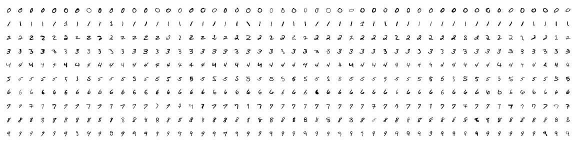
(10000, 784) (10000,)Here's what the training examples look like. I'm sure you can tell which numbers are which!

PCA Pipeline
We set up a pipeline where we first scale, and then we apply PCA. It is always important to scale the data before applying PCA.
The n_components parameter of the PCA class can be set in one of two ways:
- the number of principal components when
n_components > 1
- the number of components that explains this percentage of the total data variance, when
0 < n_components < 1
# Set number of components to extract and scale each feature to have a variance of 1
steps = [('scaling', StandardScaler()), ('pca', PCA(n_components=0.85))]
pipeline = Pipeline(steps)
pipeline.fit(x_train)Pipeline(memory=None,
steps=[('scaling',
StandardScaler(copy=True, with_mean=True, with_std=True)),
('pca',
PCA(copy=True, iterated_power='auto', n_components=0.85,
random_state=None, svd_solver='auto', tol=0.0,
whiten=False))],
verbose=False)In our case with a n_components=0.85, we select the number of principal components that account for 85% of the variance.
#Check number of components extracted to account for 85% of the variance
pipeline['pca'].n_components_185So, in this case, 185 principal components explain 85% of the variance in our dataset.
Let's see how the scaled and reduced dataset looks if we apply the inverse transformation, i.e. the steps of the pipeline in reverse order.
reduced = pipeline.inverse_transform(pipeline.transform(x_train))# let us visualize the PCA reduced number
fig, (ax1, ax2) = plt.subplots(1, 2)
ax1.matshow(x_train[0].reshape(28,28), cmap='gray')
ax2.matshow(reduced[0].reshape(28,28), cmap='gray')
ax1.set_axis_off()
ax2.set_axis_off()
fig.suptitle("Original image VS PCA reduced".format(y_train[0]))
plt.show()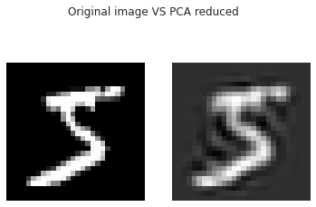
And here's what all of the PCA reduced numbers look like:

It is still effortless to distinguish each number even though we are only keeping 185 components instead of the original 784.
Training and Classification
Let's now compare image classification using the original number of features to the reduced features using PCA. We'll compare the time it takes to run both models, as well as the difference in accuracy score.
All features training
First, we train a Linear Support Vector Machine (SVM) with all the 784 pixels of the MNIST images.
steps = [('scaling', StandardScaler()), ('clf', SVC())]
pipeline = Pipeline(steps)
# train
t0 = time()
pipeline.fit(x_train, y_train)
# predict
y_pred = pipeline.predict(x_test)
# accuracy
print("accuracy:", metrics.accuracy_score(y_true=y_test, y_pred=y_pred), "\n")
# confusion matrix
print(metrics.confusion_matrix(y_true=y_test, y_pred=y_pred))
# time taken
t_all_feats = time() - t0
print("Training and classification done in {}s".format(t_all_feats))accuracy: 0.9661
[[ 968 0 1 1 0 3 3 2 2 0]
[ 0 1127 3 0 0 1 2 0 2 0]
[ 5 1 996 2 2 0 1 15 9 1]
[ 0 0 4 980 1 7 0 11 7 0]
[ 0 0 12 0 944 2 4 7 3 10]
[ 2 0 1 10 2 854 6 8 7 2]
[ 6 2 1 0 4 8 930 2 5 0]
[ 1 6 13 2 3 0 0 990 0 13]
[ 3 0 4 6 6 9 3 14 926 3]
[ 4 6 5 11 12 2 0 20 3 946]]
Training and classification done in 1147.7414350509644sWe trained a Linear Support Vector Machine (SVM) and achieved an accuracy of 0.966 in around 1147 seconds, that is around 20 minutes!
Now, we'll compare these results to reduced features.
Reduced features training
We'll train and predict using a dataset reduced with PCA, but this time we're limiting the number of components for the PCA model to 50.
# define pipeline steps
steps = [('scaling', StandardScaler()), ('reduce_dim', PCA(n_components=50)), ('clf', SVC())]
pipeline = Pipeline(steps)
# train
t0 = time()
pipeline.fit(x_train, y_train)
# predict
y_pred = pipeline.predict(x_test)
# accuracy
print("accuracy:", metrics.accuracy_score(y_true=y_test, y_pred=y_pred), "\n")
# confusion matrix
print(metrics.confusion_matrix(y_true=y_test, y_pred=y_pred))
t_reduced_feats = time() - t0
print("Training and classification done in {}s".format(t_reduced_feats))
print("Speedup {}x".format(t_all_feats/t_reduced_feats))accuracy: 0.9714
[[ 969 0 1 1 0 3 4 1 1 0]
[ 0 1128 3 1 0 1 1 0 1 0]
[ 3 0 1007 4 1 1 1 9 5 1]
[ 0 0 0 987 2 4 0 8 7 2]
[ 0 0 6 1 951 0 5 4 2 13]
[ 2 0 0 13 1 861 7 1 6 1]
[ 4 3 1 1 4 6 934 1 4 0]
[ 3 8 13 1 3 0 0 983 3 14]
[ 3 0 2 10 5 5 2 5 938 4]
[ 3 5 1 8 13 2 0 14 7 956]]
Training and classification done in 109.34926748275757s
Speedup 10.496105382982494xWe get >10x speedup when preprocessing with PCA and an accuracy score that's quite comparable to having the whole dataset. In our case, SVM is an algorithm that can handle high-dimensionality well, so there is not much difference in terms of model accuracy between using the full vs. reduced datasets.
Visualization
One popular reason to use a Dimensionality Reduction algorithm is to visualize a dataset. To achieve this, we use PCA, t-SNE and UMAP to project our data to the 2D space.
With PCA
We first use PCA to reduce the dataset to two dimensions by setting n_components=2. Then we'll visualize the dataset by plotting the two components against each other. By giving a unique color to each class, we can see some separation of the data using only two features.
%%time
# define pipeline steps
pca_pipeline = Pipeline([
('scaler', StandardScaler()),
('dim_reduction', PCA(n_components=2))
])
pca_results = pca_pipeline.fit_transform(x_train)
# create the scatter plot
fig, ax = plt.subplots(figsize=(16,11))
scatter = ax.scatter(
x=pca_results[:,0],
y=pca_results[:,1],
c=y_train,
cmap=plt.cm.get_cmap('Spectral'),
alpha=0.4)
# produce a legend with the colors from the scatter
legend = ax.legend(*scatter.legend_elements(), title="Classes",bbox_to_anchor=(1.05, 1), loc='upper left',)
ax.add_artist(legend)
ax.set_title("PCA visualization")
plt.xlabel("1st principal component")
plt.ylabel("2nd principal component")
plt.show()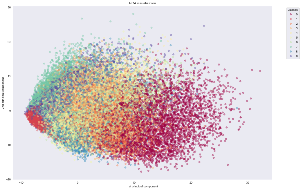
CPU times: user 8.46 s, sys: 1.65 s, total: 10.1 s
Wall time: 6.63 sWe see that PCA fails to cluster the points based on the actual information they carry. In the next experiment, we see how t-SNE manages to do exactly that.
With t-SNE
%%time
# define pipeline steps
tsne_pipeline = Pipeline([
('scaler', StandardScaler()),
# reduce to 50 PCA components, before t-SNE
# otherwise, it is gonna take forever to finish…
('dim_reduction', PCA(n_components=50)),
('2d_reduction', TSNE(n_components=2, init='pca', random_state=42))
])
tsne_results = tsne_pipeline.fit_transform(x_train)
# Create the scatter plot
fig, ax = plt.subplots(figsize=(16,11))
scatter = ax.scatter(
x=tsne_results[:,0],
y=tsne_results[:,1],
c=y_train,
cmap=plt.cm.get_cmap('Spectral'),
alpha=0.4)
# produce a legend with the colors from the scatter
legend = ax.legend(*scatter.legend_elements(), title="Classes",bbox_to_anchor=(1.05, 1), loc='upper left',)
ax.add_artist(legend)
ax.set_title("t-SNE visualization")
plt.xlabel("1st t-SNE component")
plt.ylabel("2nd t-SNE component")
plt.show()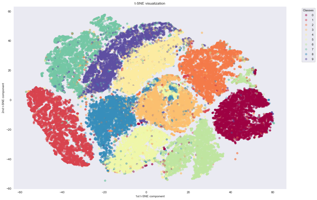
CPU times: user 43min 1s, sys: 4.58 s, total: 43min 6s
Wall time: 27min 19sAs we can see, t-SNE does a much better job of building nice clusters in 2D compared to raw PCA. This is because non-linear transformations are needed to project the initial 784-dimensional data into 2D successfully.
An important thing to mention here is regarding the computation time. PCA needs only 10 seconds, while t-SNE needs around 43 minutes, even when applied on PCA preprocessed data with only 50 dimensions. t-SNE manages to preserve the topology of the high-dimensional dataset through computationally expensive operations.
An interesting application uses t-SNE to project to 2D space: the output of large Convolutional Neural Networks trained on Imagenet. Applying t-SNE to Convoluted Neural Networks, you can get a nice clustering of semantically similar images. For more around this, see the tsne-grid Github project.
With UMAP
Now, let's try UMAP, which claims to achieve t-SNE quality at a reduced cost. Although UMAP is not part of the standard scikit-learn library, it is designed to be fully compatible with it.
Following the umap library example, we do not standardise the MNIST data before applying UMAP. This can be done because all the MNIST pixels are on the same scale (0, 255) and therefore the local distances that UMap tries to find are preserved without any scaling. For cases, that your features are independent (e.g. weight on grams and height on meters), you'd need to normalise before applying UMAP (see here).
For this to work, you need to install the umap-learn library https://github.com/lmcinnes/umap.
%%time
# run UMAP
umap_results = umap.UMAP(n_components=2, random_state=42).fit_transform(x_train)
# create the scatter plot
fig, ax = plt.subplots(figsize=(16,11))
scatter = ax.scatter(
x=umap_results[:,0],
y=umap_results[:,1],
c=y_train,
cmap=plt.cm.get_cmap('Spectral'),
alpha=0.4
)
# produce a legend with the colors from the scatter
legend = ax.legend(*scatter.legend_elements(), title="Classes",bbox_to_anchor=(1.05, 1), loc='upper left',)
ax.add_artist(legend)
ax.set_title("UMAP visualization")
plt.xlabel("1st UMAP component")
plt.ylabel("2nd UMAP component")
plt.show()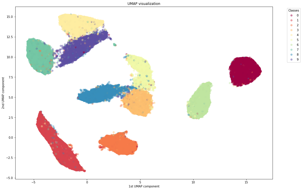
Wall time: 1min 14sWe notice the following advantages of UMAP:
- UMAP clusters the different digits quite nicely, similar to or better than t-SNE
- UMAP is much faster than t-SNE. Even in a toy dataset like MNIST, UMAP is the way to go in order to use the whole dataset.
- Unlike, t-SNE, whose distance between clusters do not have any particular meaning, UMAP can sometimes preserve the global structure. It can keep 1 far from 0, and groups together the digits 3, 5, 8 and 4, 7, 9 which can be mixed together when writing hastily.
- In contrast to t-SNE, UMAP does not need any Dimensionality Reduction preprocessing to perform. It can actually serve as a standalone Dimensionality Reduction technique and not only for visualizing to 2D.
Conclusion
In this article, we have seen how to use Dimensionality Reduction techniques to tackle the Curse of Dimensionality. We learned when to use it and how. Our case study showcased how PCA is useful for the scalability of a pipeline but it fails to grasp non-linear feature interactions. Where PCA fails, non-linear Dimensionality Reduction techniques like t-SNE can come to the rescue and help visualize a high-dimensional dataset in 2D for our human eyes to see the natural clustering of our data. Lastly, we use the UMAP algorithm, which is both better and faster than t-SNE.
Closing with an endnote, our role as Data Scientists is to handle dataset complexity and extract knowledge. Dimensionality Reduction is a great tool for that. It can help us and our algorithms understand with less effort. So make sure to add it in your toolbox!
Further learning:
A very good book for dimensionality reduction and data science in general is "Mining of Massive Datasets" (Hardcover or Free online), also available as a course on edX.
Meet the Authors

MEng in Electrical and Computer Engineering from NTUA Athens. MSc in Big Data Management and Analytics from ULB Brussels, UPC Barcelona and TUB Berlin. Has software engineering experience working at the European Organization for Nuclear Research (CERN). Currently he is working as a Research Data Scientist on a Deep Learning based fire risk prediction system.

